Building SaaS Dashboards from Figma: Charts, Tables & Real-Time Data
Why SaaS Dashboards Are the Hardest Figma-to-Code Project
Every frontend developer has converted a Figma design to code. Hero sections, feature grids, pricing pages — these follow predictable patterns. But when a product designer hands you a SaaS dashboard Figma file, the rules change entirely. You are no longer dealing with static content in a flexible layout. You are dealing with dynamic data in a rigid information hierarchy, and the gap between what Figma can represent and what production code must handle is enormous.
We have built dashboard frontends for over forty SaaS products across analytics platforms, fintech tools, logistics trackers, and HR systems. The patterns we have developed through that work are what this article covers — the specific architectural decisions that determine whether a dashboard implementation succeeds or collapses under real-world data.
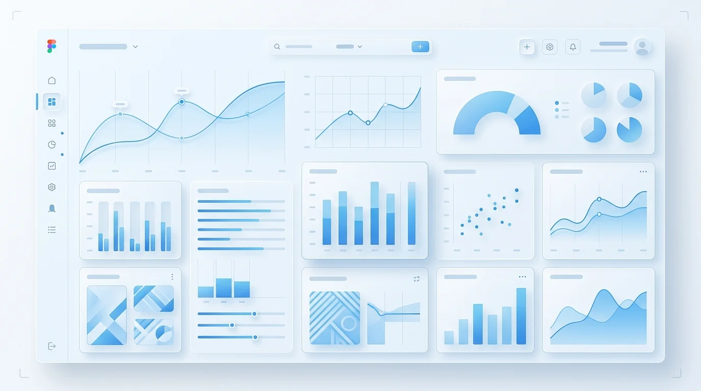
The Chart Component Problem
A chart in Figma is a vector illustration. A chart in production is a rendering engine. The Figma design specifies colours, axis labels, tooltip styling, and legend placement. What it does not specify — and cannot specify — is how the chart behaves when the dataset has three data points versus three thousand. How it animates when new data arrives. How it handles null values in a time series. How the axis scales adjust when a user switches between daily and monthly views.
Our approach is to treat each chart in the Figma design as a visual specification, then build a chart component that accepts any valid dataset and produces output matching that specification. The chart component API looks something like this: it receives data, configuration for axis formatting, colour mappings, tooltip content, and animation preferences. The visual output matches the Figma design pixel-for-pixel, but the component handles every data scenario the designer never had to consider.
For custom chart designs — radial gauges, multi-axis combinations, Sankey diagrams, or anything that does not map cleanly to a charting library preset — we build with D3.js directly. This gives us complete control over every SVG element, which means we can match any visual design without being constrained by library limitations. For standard chart types like line, bar, area, and pie, we use Recharts or Nivo with thorough theme customisation so the output is indistinguishable from a custom implementation.
Tables That Survive Real Data
The table in a Figma dashboard design typically shows eight to twelve rows of carefully formatted sample data. In production, that same table needs to handle thousands of rows without the browser grinding to a halt. This is where virtualised rendering becomes essential — only rendering the rows visible in the viewport, plus a small buffer above and below.
But virtualisation is just the beginning. SaaS tables need sortable column headers with clear directional indicators. They need filterable columns with type-appropriate filter inputs — text search for names, range selectors for numbers, date pickers for timestamps. They need pagination controls that communicate total results and current position. They need selectable rows with bulk action toolbars. They need column resizing and reordering. And every one of these features needs to match the visual specifications from the Figma file.
We build our table components with TanStack Table (formerly React Table) as the headless logic layer, then implement the visual layer to match the Figma design. This separation means the table logic is rock-solid and well-tested, while the visual presentation matches your brand exactly.
Real-Time Data Without Visual Chaos
SaaS dashboards often display real-time or near-real-time data. A metric card showing active users should update every few seconds. A chart tracking transaction volume should animate new data points onto the series. A table showing recent events should insert new rows at the top without losing the user's scroll position.
The challenge is making these updates feel smooth rather than jarring. When a number changes from 1,247 to 1,253, it should interpolate through the intermediate values using a counter animation. When a new data point appears on a chart, the line should extend with an easing curve, not teleport. When a new row appears in a table, it should slide in with a subtle transition, not cause the entire table to re-render and jump.
We implement real-time data flows using WebSocket connections or Server-Sent Events, depending on the data pattern. The connection layer handles reconnection, message queuing during disconnection, and graceful degradation. The UI layer receives data updates and applies them through animation-aware state management, so every visual change is deliberate and smooth.
Responsive Dashboard Strategy
Standard responsive design — stacking columns on narrow screens — does not work for dashboards. A four-panel dashboard that stacks vertically on a tablet becomes an endlessly scrolling page where the user loses context of the overall picture. Effective dashboard responsive design requires structural transformation, not just reflow.
Our typical responsive strategy for SaaS dashboards involves several techniques. Sidebar navigation collapses to an icon rail on tablets and a bottom navigation bar on mobile. Chart grids transform from multi-column to horizontally scrollable carousels on narrow screens. Data tables switch to card-based layouts on mobile, showing one record per card with the most important fields visible. Metric card grids maintain their grid structure but with fewer columns and adjusted sizing. The overall layout uses CSS Grid with named template areas, so each responsive state has a clearly defined layout map rather than a cascade of override rules.
Dark Mode Is Not Optional
Nearly every SaaS product now requires dark mode support, and dashboards are where dark mode is most complex. Charts need entirely different colour palettes — colours that provide sufficient contrast on a dark background are often different from the primary brand colours used on light backgrounds. Table row striping, border colours, and hover states all need dark variants. Metric cards need shadow and elevation adjustments.
We implement dark mode using CSS custom properties mapped directly from Figma's dark theme tokens. The theme switch is instant — no flash of unstyled content, no re-render — because it is a CSS variable change, not a JavaScript state change. Every component, including charts with custom SVG colours, respects the current theme.
If you are building a SaaS product with a data-heavy dashboard and your Figma designs are ready, book a free consultation. We will review your designs and give you a realistic picture of the implementation approach, timeline, and cost.
 Custom SaaS Development
 Web App Development
 API Development