How We Implement Complex Data Visualisations from Figma
The Gap Between a Figma Chart and a Production Chart
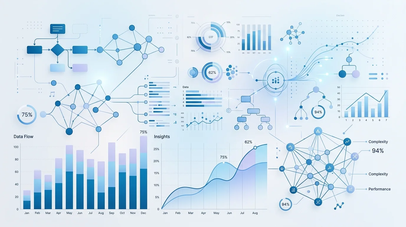
Data visualisation is where the distance between Figma and production is widest. A designer creates a line chart in Figma using vector paths, carefully positioned axis labels, a styled tooltip, and a colour-coded legend. It looks polished. It communicates the data clearly. And it has almost nothing in common with the code that will render the same chart in a browser.
In production, that chart needs to accept any dataset, scale its axes dynamically, render hundreds or thousands of data points without performance issues, show interactive tooltips on hover, handle missing data gracefully, animate between data states, resize responsively, and remain accessible to screen readers. None of these behaviours exist in the Figma file. They must be engineered from the visual specification.
This article covers how we approach that engineering challenge — the specific decisions and techniques we use to turn Figma chart designs into production data visualisations that match the design exactly while handling every real-world scenario the designer did not have to consider.
Choosing Between D3.js and Recharts
The first decision for any chart implementation is the rendering approach. We use two primary tools, and the choice depends on the chart type and level of design customisation required.
Recharts is our default for standard chart types — line charts, bar charts, area charts, pie charts, and scatter plots. It provides a declarative React API, handles axis scaling and layout automatically, and supports theming. When the Figma design shows a standard chart type with custom colours, fonts, and spacing, Recharts can usually match the design with thorough theme configuration. The development speed is significantly faster than D3.js for these standard types.
D3.js is our choice when the design requires full visual control. Radial bar charts, Sankey diagrams, treemaps, chord diagrams, multi-axis combination charts, or any visualisation where the layout logic is custom — these require D3.js. We also use D3.js when a standard chart type has design elements that fall outside Recharts' customisation capabilities, such as gradient fills along a line path, custom tick mark shapes, or animated axis transitions.
In practice, many SaaS dashboards use a combination of both. Standard metric charts use Recharts for development efficiency. The hero visualisation on the overview page — often a more complex, custom design — uses D3.js for complete control.
Axis Implementation
Axes are deceptively complex. The Figma design shows axis labels at specific positions with specific formatting — "Jan", "Feb", "Mar" along the x-axis; "0", "25k", "50k", "75k", "100k" along the y-axis. In production, the chart component does not know the data range in advance. The axis must scale dynamically based on the actual data, choose appropriate tick intervals, format labels according to the data type (dates, numbers, currencies, percentages), and avoid overlapping labels when the chart is narrow.
Our implementation starts with the Figma axis design as the target visual output, then builds the scaling logic to reproduce that output for any data range. We define format functions for each axis based on the data type — date formatters with appropriate granularity, number formatters with abbreviations for large values, currency formatters with locale-appropriate symbols. We set tick count targets that match the density shown in the Figma design, then use D3's axis generators or Recharts' tick configuration to produce output that visually matches the specification.
Tooltip Design Implementation
Tooltips in Figma charts are typically designed as small, floating cards with specific typography, padding, shadow, and content layout. Implementing these requires a custom tooltip component that matches the Figma specification and positions itself correctly relative to the data point.
For Recharts implementations, we use the custom content prop to inject our own tooltip component. For D3.js implementations, we render the tooltip as a React portal that positions itself based on the mouse event coordinates and the data point's pixel position. In both cases, the tooltip component is a standard React component styled to match the Figma design, with props for the data values it needs to display.
Tooltip positioning requires care — the tooltip must avoid overflowing the chart container or the viewport. We implement boundary detection that flips the tooltip position when it would overlap an edge, and adjust the arrow pointer direction accordingly. These behaviours are invisible in the Figma design but essential in production.
Animation Strategy
Chart animations serve two purposes: they make initial data loading feel polished, and they communicate data changes meaningfully. A line chart that draws itself on load tells the user "this data just arrived." A bar chart where bars grow to new heights tells the user "these values changed."
Our animation approach varies by chart type. Line and area charts use path interpolation — the SVG path animates from a flat baseline to the data shape using CSS transitions on the stroke-dashoffset property. Bar charts animate height from zero using Framer Motion's spring physics for a natural feel. Pie charts use arc interpolation that sweeps each segment into view sequentially.
For data updates — when new data arrives via WebSocket or user interaction — we use transition animations that morph between the old and new states. D3's transition API handles this natively for SVG elements. For Recharts, we manage the animation through React state transitions with carefully tuned duration and easing values.
Critically, all chart animations respect the prefers-reduced-motion media query. Users who have indicated a preference for reduced motion see instant data rendering without animation. This is not optional — it is an accessibility requirement.
Responsive Chart Resizing
Charts must resize responsively, and this is more complex than setting width to 100%. When a chart becomes narrower, the axis labels may overlap, the legend may need to reposition from right-aligned to bottom-aligned, the tooltip may need to change from appearing beside the cursor to appearing as a fixed panel below the chart, and the number of visible data points may need to change to maintain readability.
We use a ResizeObserver-based hook that tracks the chart container dimensions and feeds them into the chart component as render props. The chart component then makes responsive decisions based on its actual rendered width — not viewport-level breakpoints. This means a chart in a narrow sidebar panel behaves differently from the same chart in a full-width layout, which is correct behaviour that viewport breakpoints cannot achieve.
Accessibility for Data Visualisations
Charts are inherently visual, which creates an accessibility challenge. Screen reader users need access to the same information that sighted users get from the visual representation. Our approach combines several techniques.
Every chart has a descriptive aria-label that summarises what the chart shows — for example, "Line chart showing monthly revenue from January to December 2025, trending upward from 45,000 to 78,000 pounds." This gives screen reader users the headline insight immediately. We include a visually hidden data table that presents the chart data in tabular format, accessible via a "View as table" toggle. This gives screen reader users access to the exact data values. Interactive elements within charts — clickable data points, hoverable series — have appropriate ARIA roles and keyboard event handlers so they can be operated without a mouse.
For live-updating charts, we use ARIA live regions to announce significant data changes — "Revenue updated: now 78,500 pounds" — without overwhelming the user with every minor fluctuation.
If you have Figma designs with complex data visualisations that need production implementation, book a free consultation. We will review your chart designs and provide a detailed plan for implementation, including technology recommendations and timeline.
 Custom SaaS Development
 Web App Development
 API Development