Figma to Code for SaaS Dashboards: Where Data Meets Design
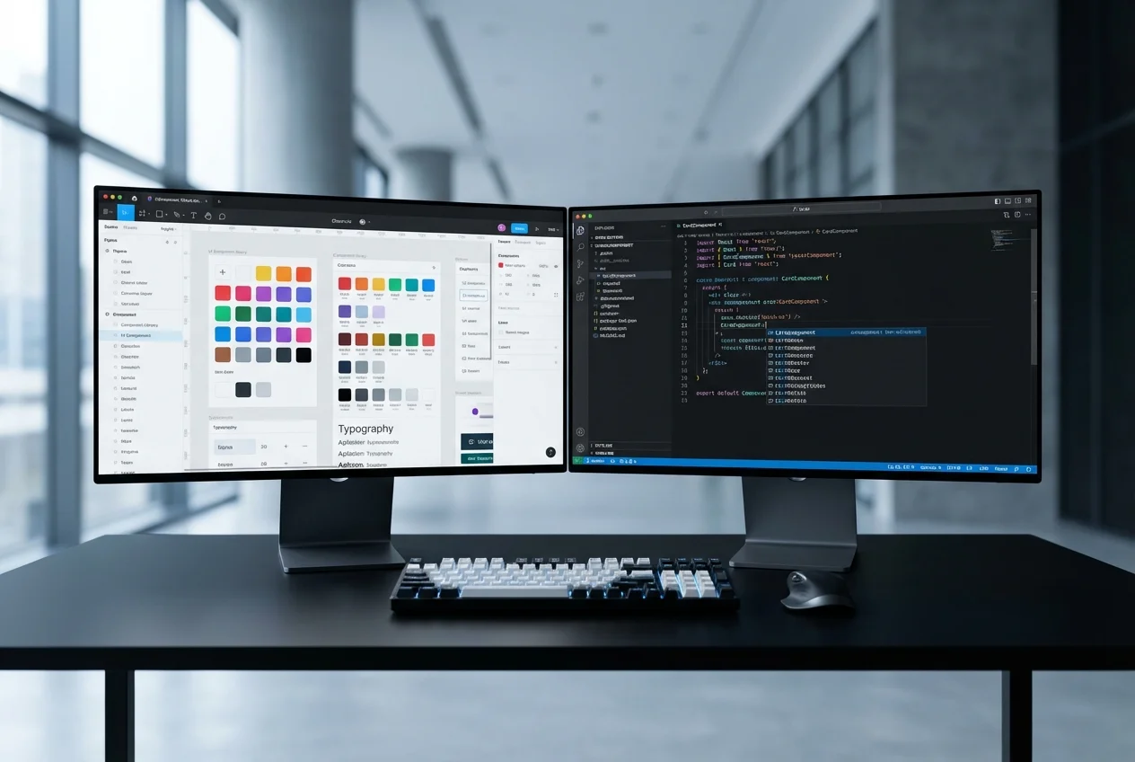
SaaS dashboard designs are fundamentally different from marketing pages or standard web applications. Every screen is packed with information — charts showing trends over time, tables displaying hundreds of rows with inline actions, metric cards updating in real time, and multi-panel layouts where every pixel of space matters. Converting these designs from Figma to production code demands a team that understands both frontend engineering and data visualisation architecture.
Most Figma-to-code services treat dashboard components like any other UI element. They produce static chart images where interactive visualisations should be. They build tables that collapse under real data volumes. They ignore the WebSocket connections and polling mechanisms that make dashboards feel alive. Our service is built specifically for the complexity that SaaS dashboards demand.
The Dashboard Challenge
When a designer creates a SaaS dashboard in Figma, they are designing an information architecture — not just a layout. The placement of a chart next to a KPI card is intentional. The hierarchy of data in a table reflects user workflows. The colour coding in a status indicator maps to business logic. Implementing these designs correctly requires understanding the data relationships behind the visual decisions.
Here is what makes SaaS dashboard implementation uniquely difficult:
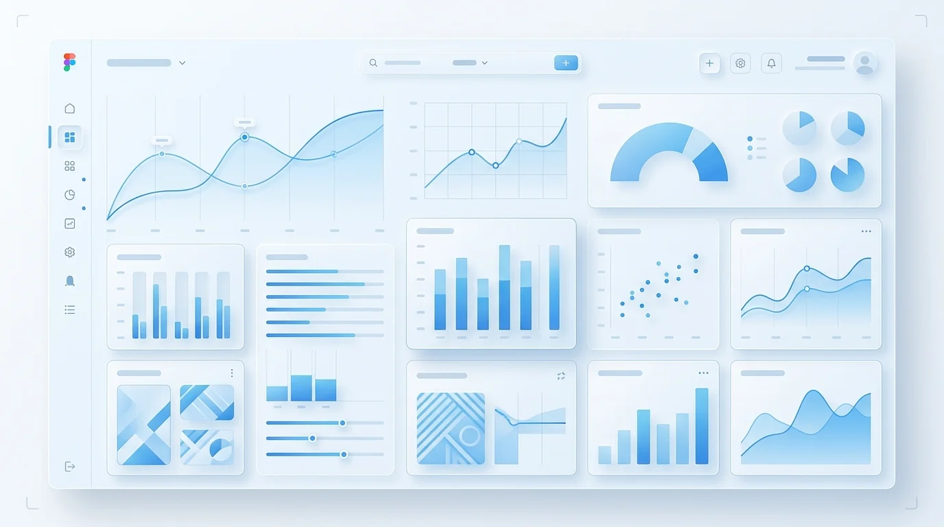
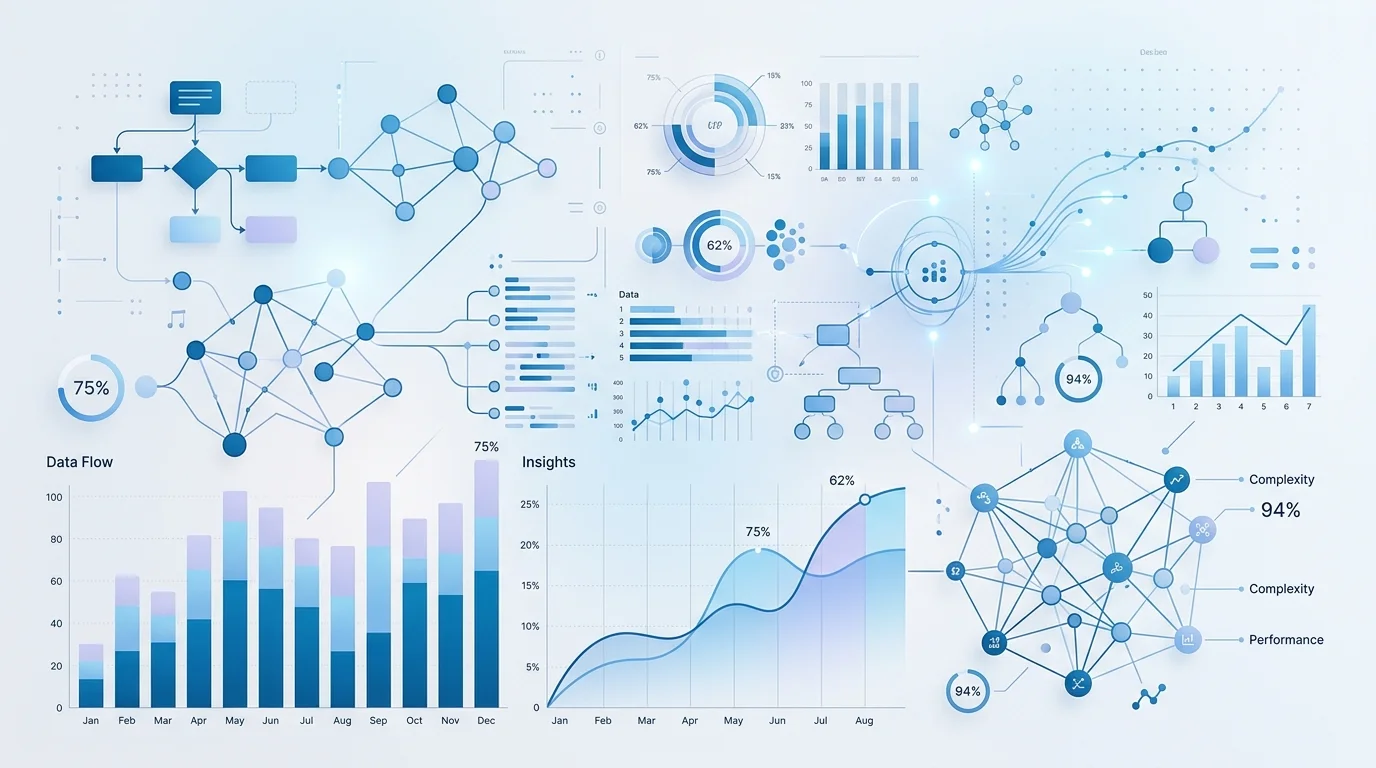
- Charts are logic, not layout: A line chart in Figma is a static image. In production, it needs to accept dynamic datasets, handle axis scaling, render tooltips on hover, support zoom and pan, animate on data change, and resize responsively — all while matching the exact visual style from the design. This requires deep knowledge of charting libraries and custom SVG rendering.
- Tables handle real data volumes: A designer creates a table with 8 example rows. In production, that table needs virtualised rendering for 10,000+ rows, server-side pagination, sortable columns, filterable headers, inline editing, row selection, and column resizing — without any performance degradation.
- Real-time updates must feel seamless: When new data arrives via WebSocket, metric cards should update with smooth number transitions, charts should animate new data points onto the existing series, and table rows should insert or update without layout shifts or flicker.
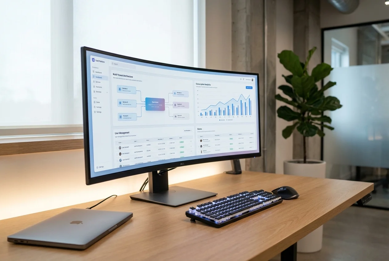
- Multi-panel layouts are structurally complex: SaaS dashboards often feature resizable panels, collapsible sidebars, and draggable widget grids. These layouts require careful state management and CSS architecture that goes well beyond standard responsive design.
Our Approach to Dashboard Implementation
- Data Architecture Review: Before writing any component code, we map out the data flow. Which charts need real-time data? Which tables require server-side operations? What are the update frequencies? This analysis determines our state management and data-fetching strategy.
- Chart Component System: We build a chart component library that matches your Figma designs exactly — custom colour palettes, specific axis formatting, branded tooltip designs, and consistent animation patterns. We use D3.js for fully custom visualisations and Recharts or Nivo for standard chart types with custom theming.
- Table Component Architecture: Our table components are built for SaaS-scale data. Virtualised rendering with TanStack Table, server-side sorting and filtering, customisable column definitions, and inline action menus — all matching the visual specifications from your Figma files.
- Real-Time Data Layer: We implement the WebSocket or SSE connections that power live dashboards, with proper connection management, reconnection logic, and optimistic UI updates that make the dashboard feel responsive even under high data throughput.
- Theme System: SaaS products increasingly require dark mode. We implement your Figma dark and light themes as a CSS custom property system that switches instantly, with every chart, table, and metric card adapting correctly.
What Sets Our Dashboard Work Apart
- Charts that match your Figma designs precisely — not charting library defaults with a colour override
- Tables that perform under production data volumes, not just with 10 demo rows
- Real-time displays that update smoothly without layout shifts or re-renders
- Responsive dashboard layouts that remain usable on tablets and large monitors alike
- Dark/light theme switching that covers every component, including chart colours and table borders
- Accessibility for data-dense interfaces — screen reader announcements for live data, keyboard-navigable tables, and proper ARIA attributes on interactive charts
Technology Choices
We use React and Next.js with TypeScript as our foundation. For charts, we select the right tool for each visualisation: D3.js for fully custom or complex interactive charts, Recharts for standard chart types that need consistent theming, and Nivo for statistical visualisations. Tables are built with TanStack Table for headless flexibility. Real-time data flows through WebSocket connections managed with proper React state patterns. The entire dashboard is styled with CSS custom properties for instant theme switching.

 Custom SaaS Development
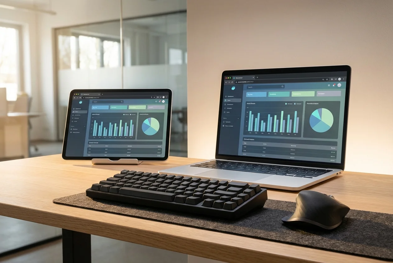 Web App Development
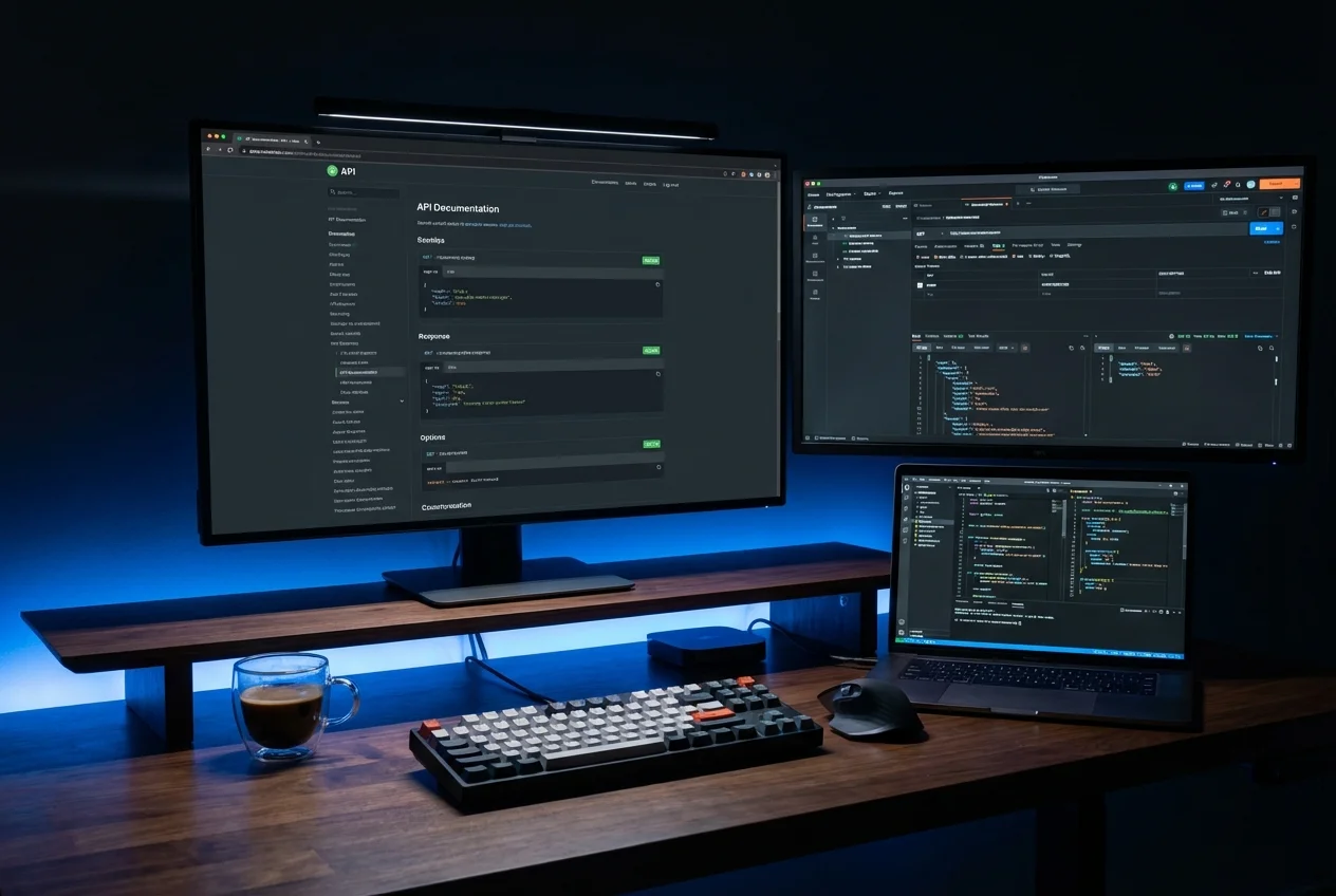 API Development
 Mobile App Development
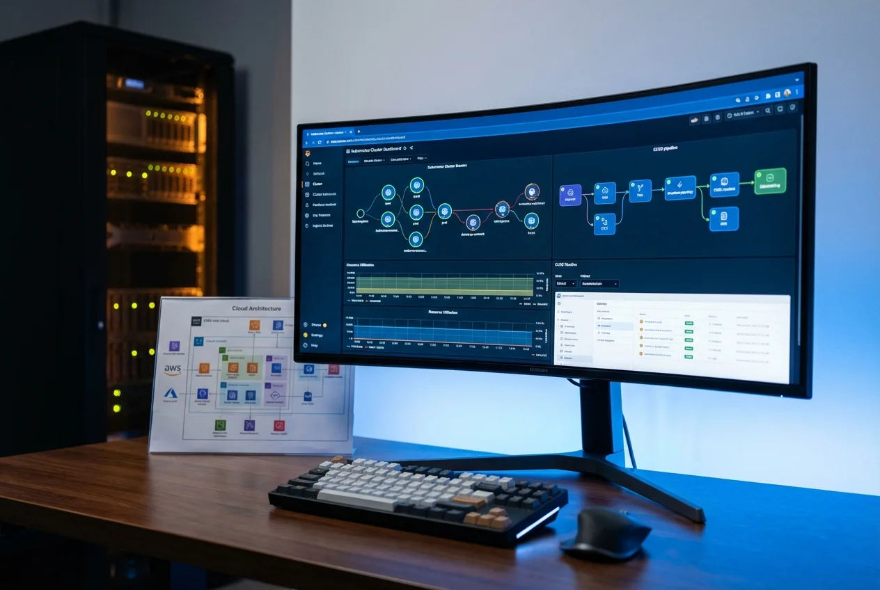 DevOps & Cloud
 Technical Consulting